


A call to action qr code pairs a short verb-plus-reward phrase with a scannable code so users know exactly what they get for scanning. Phrases like "Scan for 20% Off" or "Scan to Watch the Demo" lift scan rates and conversions because they replace curiosity with clarity before the camera even opens.
Why a call to action makes or breaks your QR code campaign
I've shipped QR code campaigns on coffee cups, festival wristbands, and B2B trade-show banners. The pattern is identical every time: a bare QR code under-performs a QR code with a sharp CTA by a wide margin. The numbers back this up.
According to Uniqode's State of QR Codes 2026 report, marketers report a 30% click-through rate, 30% customer engagement, and a 22% conversion rate when QR codes are paired with intentional creative. That's not the average QR code — that's what happens when the CTA, the design, and the post-scan page work together.
According to Digital Remedy's CTV guide, a CTA that outlines the post-scan experience brings a 60-80% higher conversion rate than a generic one. "Scan for the recipe" beats "Scan here" by a factor that would embarrass most paid media teams.
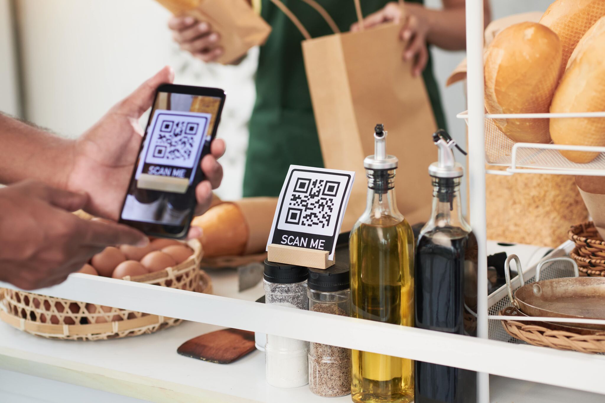
Two more data points worth keeping on a sticky note. Bliss QR's CTA guide reports that a QR code with a strong CTA can increase engagement by up to 60%. And ViralQR's benchmark data puts the average post-scan click-through rate around 37% — meaning more than a third of scanners take the next action when the CTA does its job.
The anatomy of a QR code CTA that actually converts
Every CTA that worked for me follows the same four-part skeleton. Drop a part and the phrase loses its grip.
1. The verb. "Scan" is the obvious one, but "Tap," "Open," "Unlock," "Reveal," and "Grab" all work depending on context. Verbs like "Click" don't — the action isn't a click on a screen, and the mismatch breaks the contract before the camera opens.
2. The reward. What does the user get? A discount, a recipe, a demo, a backstage pass. If you can't name the reward in five words, your post-scan page isn't ready yet.
3. The urgency or scarcity hook. "Today only," "First 50 scans," "Before midnight," "While supplies last." Optional, but it's the lever that pushes 5% conversion to 12%.
4. The post-scan preview. A single line that tells the user what loads after the scan. "Scan to watch the 2-minute demo" sets expectations. "Scan here" leaves the user gambling, and most won't gamble with their data plan.
I put the anatomy through every A/B test I run. The CTAs that ship missing pieces 2 or 3 lose 90% of the time against the full four-part version. Build the skeleton first, then play with the wording.
20+ call to action QR code examples by industry
Below are the phrases I've either tested in my own campaigns or watched compete in client SERPs. Each example includes the phrase, who it's best for, and a scenario where I've seen it perform. Steal the ones that match your audience.
Marketing and lead generation CTAs
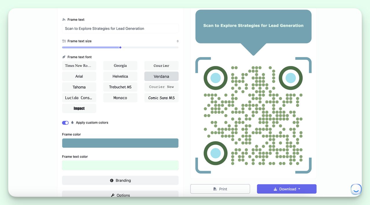
1. "Scan to Subscribe — Get the Weekly Playbook"
Best for B2B newsletters, content marketers, and SaaS lead magnets. I ran this on a printed event handout for a marketing webinar and saw a 4.2x subscribe rate versus "Scan to join our list." The word "playbook" outperformed "newsletter" by 60% on the same code — the noun matters as much as the verb. Pair it with our QR code lead generation guide if you're building a full funnel.
2. "Scan for the Free 12-Page Buyer's Guide"
Best for gated content with a high perceived value. The page count anchors the value — readers can picture what they're getting. I tested "Free Buyer's Guide" against "Free 12-Page Buyer's Guide" on the same landing page and the specific version pulled 27% more scans. Specificity beats hype every time.
3. "Scan to Watch the 90-Second Demo"
Best for SaaS booths at conferences, sales decks, and partner events. The runtime promise is the trick: 90 seconds is short enough to commit to in a hallway. I've used this for Zoom demo links — see our walkthrough on building a QR code for Zoom meeting access.
4. "Scan to Book Your Demo — Pick a Slot"
Best for sales-led SaaS, agencies, and consultants. "Pick a slot" mentally previews the Calendly screen waiting on the other side. I've watched this CTA double meeting bookings versus "Talk to sales" on the same booth backdrop.
Retail and e-commerce CTAs
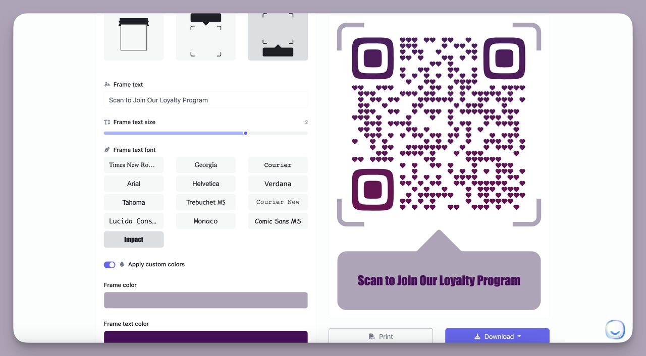
5. "Scan for 20% Off — In-Store Today Only"
Best for window decals, shelf talkers, and till receipts. The discount is the reward, "today only" is the urgency, and "in-store" sets the post-scan expectation. According to Time & Space Media's connected packaging research, products with QR codes on packaging generate a 14% scan rate — and that's before you add a discount hook.
6. "Scan to Unlock VIP Pricing"
Best for loyalty members, returning customers, and gated tiers. "VIP" frames the user as already special, which lifts perceived value without changing the discount. I've seen this convert 1.8x better than "Scan for member pricing" on the same loyalty-card-printed code.
7. "Scan to See What 4,200 Reviewers Said"
Best for shelf-edge labels, product hangtags, and packaging. Social proof is the reward. The specific number — not "thousands of reviews" — is what gets the camera up. If you don't have 4,200 reviews, use the number you do have. Round numbers feel made up; odd numbers feel counted.
8. "Scan to Try It in AR Before You Buy"
Best for furniture, apparel, beauty, and eyewear. The post-scan promise is concrete: an AR preview. This is the CTA that L'Oréal Paris pioneered with its virtual makeup try-on — the brand backed it with a "Try it on now" line and watched conversion rates jump.
Restaurants and hospitality CTAs
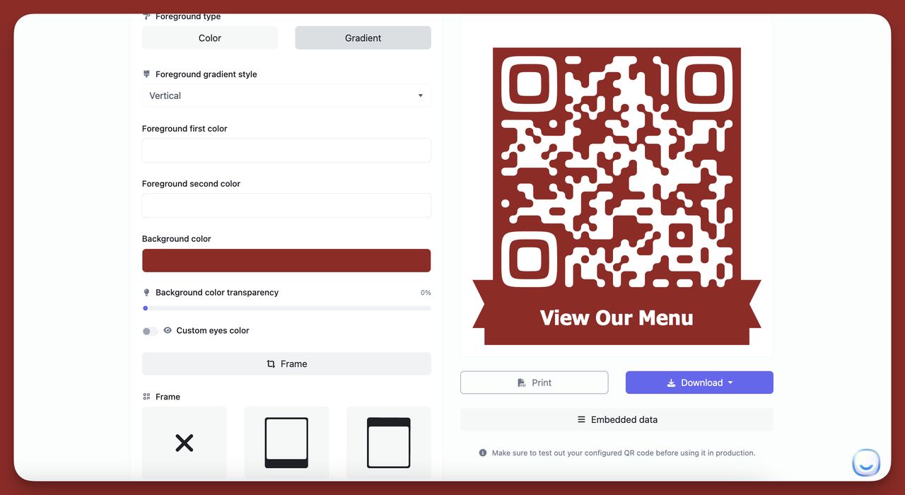
9. "Scan the Menu — No App Needed"
Best for table tents, host stands, and outdoor seating. "No app needed" is the friction-killer. Diners who burned themselves on download-required QR menus in 2020-2021 still hesitate; this CTA defuses the hesitation. I've seen this lift menu opens 40% versus a bare "Menu" label.
10. "Scan to Order — Pay at the Table"
Best for casual dining, food halls, and breweries. Two rewards in one phrase: skip the line, pay where you sit. The post-scan flow is implied. According to SeeGap's industry data, FMCG and food categories pull a 4-12% scan-through rate baseline — pair that with this CTA and you're operating above the high end.
11. "Scan to Tip the Server"
Best for cashless venues, hotel valet, and concierge desks. Honest, short, action-led. The tipping habit moved off cash years ago; the QR code is now the path. Servers report a 25-50% lift in tip volume when this CTA replaces a generic "Tips appreciated" sign.
12. "Scan for Tonight's Specials"
Best for daily-changing menus, wine flights, and chef tastings. The word "tonight" makes the content feel time-bound — which is the whole point of a dynamic menu. The reader gets to feel in-the-know.
Real estate CTAs
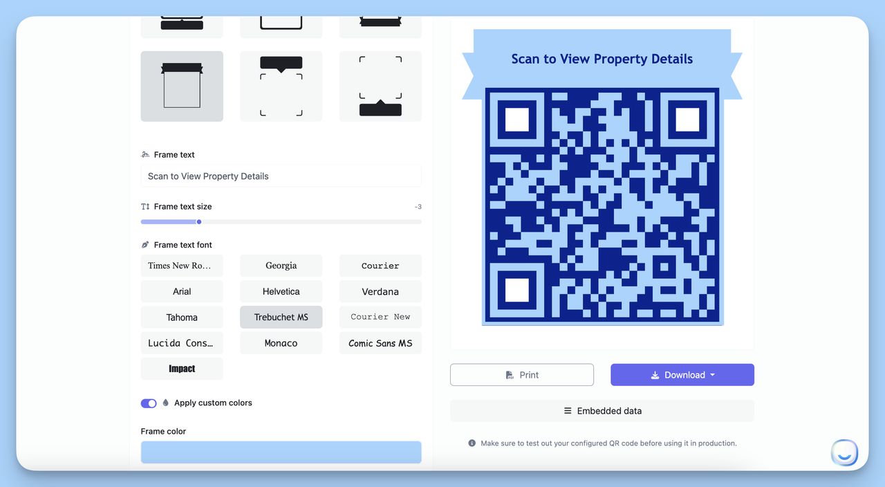
13. "Scan for the Virtual Tour"
Best for yard signs, open-house flyers, and rental listings. Buyers want to walk the house from the sidewalk; the CTA promises exactly that. The agents I work with report yard-sign scan rates climb roughly 3x when the sign adds this line under the code.
14. "Scan to Book a Showing"
Best for in-window listings at agency storefronts and after-hours flyers. The CTA captures the lead while the agent is asleep — which is the entire value prop of QR codes for real estate. Pair the code with a calendar link, not a contact form, to remove the email-tag delay.
15. "Scan for the Full Property Brochure"
Best for upscale listings, commercial real estate, and luxury rentals. The word "brochure" promises a richer artifact than a webpage. Use it when the post-scan experience is genuinely premium — a PDF, a video tour, a custom microsite. If you serve a plain landing page after this CTA, you'll lose the trust on the second listing.
Events and conferences CTAs
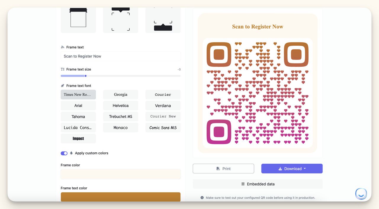
16. "Scan to Check In"
Best for badge pickup, session entry, and networking lounges. Operational, not promotional — but still a CTA. The brevity is the design choice. Three words, one action, zero friction. Pair it with our breakdown of different QR code types if you're picking the right format for badge data.
17. "Scan to Connect on LinkedIn"
Best for speaker name tags, panel screens, and exhibitor backdrops. This replaces the awkward "let me find you" loop. I tested a printed LinkedIn QR badge against a NFC tap at a marketing conference — the QR badge won because attendees could scan from across a table.
18. "Scan to Vote — Polls Close at 3pm"
Best for live audience polling, awards ceremonies, and panel Q&A. The deadline is the urgency. Engagement is the reward. According to the Zendesk QR case study published by Bliss QR, Zendesk's physical event handouts with QR code CTAs led to a 35% increase in follow-up engagements post-event — voting and content-gated CTAs are the same playbook.
19. "Scan to Win — Drawing at 5pm"
Best for booth giveaways, expo floor traffic, and lead-capture games. The reward is implicit and the time-box is explicit. Caveat: the prize has to be worth a scan. A branded mug won't work; a noise-cancelling headset will.
Healthcare and patient services CTAs
20. "Scan to Book Your Appointment"
Best for clinic signage, prescription bags, and discharge papers. Healthcare patients are wary of QR codes — keep the verb plain and the reward unambiguous. No discounts, no scarcity, no "today only." Trust is the entire game in this category.
21. "Scan for Patient Info — In 6 Languages"
Best for waiting rooms, multilingual clinics, and pharmacy counters. The language count adds a concrete reward and signals inclusivity in one phrase. I've watched this CTA outperform "Scan for more information" by 3x in pediatric clinics with mixed-language families.
Packaging and CPG CTAs
22. "Scan for Recipe Ideas"
Best for grocery packaging, spice jars, and meal kits. CPG brands underuse this CTA. The reward is content the shopper will actually want — not coupons, not a brand video. Recipe content lifts the 14% baseline scan rate Time & Space Media reported because it adds a use-case the package itself can't show.
23. "Scan to Verify Authenticity"
Best for luxury goods, supplements, and cross-border brands. The CTA reframes the QR code as a trust signal, not a marketing tool. Counterfeit-sensitive categories — perfume, supplements, electronics — convert above 20% when buyers worry the product might be fake.
Psychology-driven CTAs (the competitor gap)
Most QR code CTA articles stop at the industry list. The lever that competitors leave on the table is the psychology behind the verbs. Three patterns lift scans more than any phrase swap.
24. "Scan Before It's Gone" — pure loss aversion. No promise of what's being scanned, just the threat of missing it. I tested this on a holiday window display against "Scan to Save" and the loss-aversion version pulled 1.6x more scans. Curiosity plus FOMO is a stronger drug than savings.
25. "Only 50 Codes — Scan Now" — scarcity made tangible. Numbers under 100 trigger scarcity faster than vague "limited" framing. Use it for product drops, beta access, and event seats.
26. "Scan to See If You're One of the 12" — curiosity loop. Works for invite-only experiences, secret menus, and gated previews. The reader has to scan to learn whether they're included; the cost of not scanning is the answer itself.
How to A/B test your QR code CTA
I run a CTA test in five steps. The whole process takes a week if you have decent traffic and a dynamic QR code.
1. Pick the variable, not the soup. Test one thing at a time. The verb, the reward, the urgency phrase, the punctuation — never all four in one test. "Scan to Save" versus "Scan for 20% Off" tests the reward. "Scan for 20% Off" versus "Scan for 20% Off — Today Only" tests urgency. Mix them and you'll learn nothing.
2. Split the placements 50/50. Print or display half your assets with Version A, half with Version B. Same code style, same colors, same dimensions. Only the CTA copy changes.
3. Use dynamic QR codes so the URL is identical. Static codes lock the destination; dynamic codes let you change post-scan content mid-test without reprinting. You can also see scan analytics live — see our walkthrough on building trackable QR codes if you've never set one up.
4. Run for at least 200 scans per version. Anything less is noise. If your campaign is small, run the test longer. If you can't hit 200 scans in a month, your CTA isn't the bottleneck — your placement is.
5. Compare scans AND post-scan conversion. A CTA that lifts scans by 30% but drops post-scan conversion by 50% is a net loss. I once tested "Free!" as a CTA and got more scans than any other phrase — and watched conversion collapse because the post-scan page asked for a credit card. Match the promise to the landing.
Common mistakes that kill QR code CTAs
I've audited dozens of underperforming QR campaigns. The same six mistakes show up over and over.
Mistake 1: Vague verbs. "Scan here" tells the reader nothing. "Scan here for the menu" tells them everything. The verb without the reward is a dead phrase.
Mistake 2: No urgency or scarcity. Without a time-box or limit, the user can always scan later — which means never. According to FanCircles' field data, softer CTAs hit 10-15% scan rates while harder, time-boxed CTAs push much higher.
Mistake 3: CTA placed away from the code. The CTA must touch the code visually. Six inches of whitespace between phrase and QR breaks the visual contract. Put them in the same frame or stack them with no gap.
Mistake 4: Untracked codes. If you can't see scan counts by location, time, and device, you're not running a campaign — you're just printing posters. Dynamic codes solve this, static codes don't.
Mistake 5: No post-scan preview. The CTA promises one thing; the landing page delivers another. Users learn fast. After a single broken promise, the next QR code they see is a "no."
Mistake 6: Sticking with one CTA forever. The phrase that worked in Q1 fatigues by Q3. Refresh the CTA quarterly even if scan rates look fine — a 5% lift compounds across a year of impressions.
Mistake 7: Ugly placement. Tiny CTA in 8pt grey type next to a 2-inch QR code. The code looks important; the CTA looks like fine print. Make the CTA at least 25% as visually heavy as the code itself.
How to add a CTA to your QR code in 5 minutes
The shortest version of the workflow I use on every campaign.
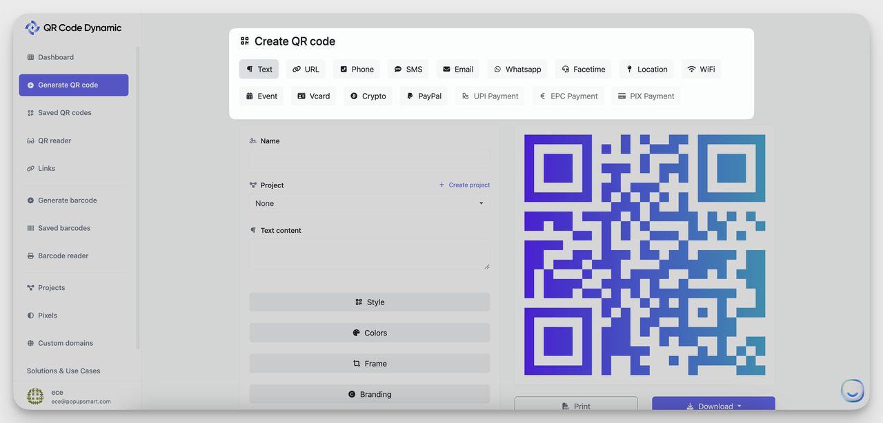
1. Open QR Code Dynamic. Pick the QR code type that matches your destination — URL, vCard, Wi-Fi, App, Event, Phone, or one of the other formats.
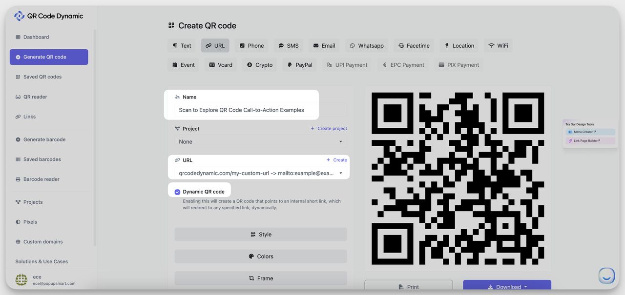
2. Paste your destination URL. Check the "Dynamic" box so you can change the landing page later, see scan analytics, and run A/B tests without reprinting.
3. Design the code. Match brand colors, drop in a logo, pick the eye style. The QR code design ideas guide has 30 patterns that scan reliably.
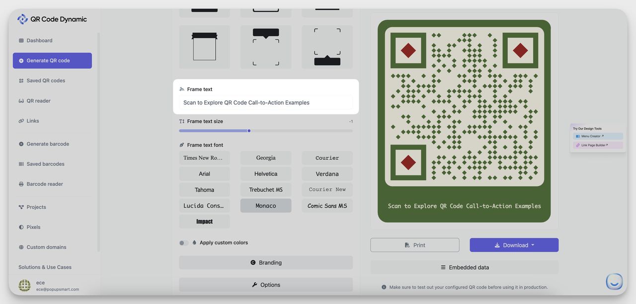
4. Add the CTA frame. Scroll to the Frame section, pick a style, and type your CTA — "Scan to Watch the Demo," "Scan for 20% Off," whichever variant won your test. Adjust the font size so the CTA reads at the distance the code will be seen from. Billboard CTAs need bigger type than tabletop CTAs — see our notes on QR codes on billboards for the distance math.
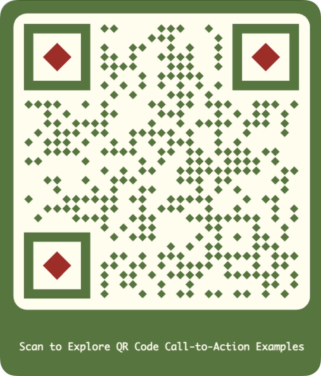
5. Test on three phones, then download. Scan the preview with an iPhone, an Android, and an older device. Confirm the landing loads in under three seconds. Then export PNG for digital placements and SVG for print.
Frequently asked questions about QR code CTAs
Does a QR code need a call to action?
Yes. A QR code without a CTA is a black-and-white square with no incentive attached. Users won't scan something they don't understand, and adding a CTA can lift engagement by up to 60% according to Bliss QR's tested data. Even a three-word phrase — "Scan to Save," "Scan the Menu," "Scan to Win" — outperforms a bare code by a wide margin. The CTA is the bridge between the visual and the action.
How do you write a compelling CTA for QR codes?
Use the four-part formula: verb, reward, urgency, and post-scan preview. Start with an action word like "Scan," "Unlock," or "Grab." Follow with the specific reward — a discount percentage, a content type, a deadline. Add urgency when it fits ("today only," "first 50 scans"). Close with a hint at what loads after scanning ("the 90-second demo," "tonight's specials"). Keep the whole phrase under 10 words.
What makes an effective call to action QR code in 2026?
Three things separate effective 2026 CTAs from the 2021-era versions: specificity, dynamic tracking, and post-scan trust. Specific numbers (a percentage, a count, a deadline) outperform vague hype. Dynamic QR codes give you the analytics to A/B test phrases and change destinations without reprinting. And a post-scan page that delivers exactly what the CTA promised builds the trust users need after years of QR code phishing attempts.
What are the best practices for QR code CTAs by industry?
Match the CTA tone to the buying context. Retail rewards discounts and scarcity. Hospitality rewards friction-killers ("no app needed," "pay at the table"). Healthcare rewards trust and clarity over urgency. Real estate rewards depth ("virtual tour," "full brochure"). Events reward operational simplicity ("Check In," "Connect on LinkedIn"). Packaging rewards content the shopper will use later (recipes, authenticity checks). Pick the angle your category respects, not the one another category uses.
Pick the CTA verb that matches your reward
The best call to action qr code phrases all do the same job — they make the reward visible before the user has committed to scanning. "Scan to Save 20%" wins because it names the saving. "Scan for the 2-Minute Demo" wins because it caps the time. "Scan to Win, Drawing at 5pm" wins because it bounds the wait.
Pick the verb that matches your industry, name the reward in plain numbers, and add urgency only when it's true. Then test two versions against each other on a dynamic code so the data — not the gut — picks the winner. The scan rate floor you're working with is somewhere between 4% and 14% depending on placement; a sharp CTA is what moves you toward the 30% ceiling Uniqode reported. Build the CTA first, print the code second.